Creating High-converting Landing Pages
Have you ever ended up spending much more time, maybe even buying more than you intended, in a well designed, inviting store? Well, your online shop’s landing page serves the same purpose. It’s the storefront that welcomes visitors, drawing them in with all the bells and whistles to keep them engaged and exploring. Its appeal can determine whether or not visitors stay on the website and ultimately turn into customers. The more inviting and functional your landing page is, the more likely your visitors are to stay for longer and take the desired action, just like they would in their favorite shop.
We’re experts in eCommerce development services and we’re here to help you choose the right solution for your business.
The importance of having a catching landing page has been heavily researched and documented. On average, online stores that optimize their landing pages typically see an impressive conversion lift – sometimes close to 45%. More than that, landing pages that offer a personal experience, tailored to every user’s need, convert 3-4 times better than generic ones.
One of the best examples of a retailer that has mastered the art of creating a first-walk inviting environment and extended it successfully to their online store, is IKEA. IKEA’s website mirrors the physical store experience, offering an intuitive navigation system that guides users through various product categories and rooms. The online layout is designed to be just as engaging, with high-quality images, detailed product descriptions, and inspirational content. Beyond comfort and convenience, online, IKEA uses tools like product recommendations based on browsing history to create a personalized shopping experience, similar to how a physical store might offer a personalized service.
Key elements of a high-converting landing page
There are some elements that play a crucial role in crafting a landing page that doesn’t just attract visitors, but enhances the user experience and drives results.

Grabbing attention from the first glance with clear and compelling headlines and concise descriptions
As the saying goes, you never get a second chance to make a first impression and your headline is just that. A clear and compelling headline can make your visitors want to know more, just like a good salesperson.
The best headlines speak directly to the needs and desires of your audience, resonating with their emotions and promising a solution to their problem. It’s about striking a chord, whether through bold statements, intriguing questions, or clear benefits. To craft a headline that sticks, keep it concise, make it specific, and ensure it’s directly aligned with what your audience cares about. The goal is to stop them in their tracks and make them think, “Yes, this is exactly what I’m looking for.”
When it comes to copy, it’s best to align it with the user’s intent; if they’re looking for a solution, show them how you solve their problem. Focus on benefits rather than features, and make it clear how your offer will improve their life.
Nowadays, you can use tools like ChatGPT to help you create product descriptions. But beware of the mistakes that many make – using solely LLM software, without any personal input. Apply your brand tone and make the copy flow naturally, guiding the visitor through your page without overwhelming them with too much information.
Creating an experience that sells with high quality visuals
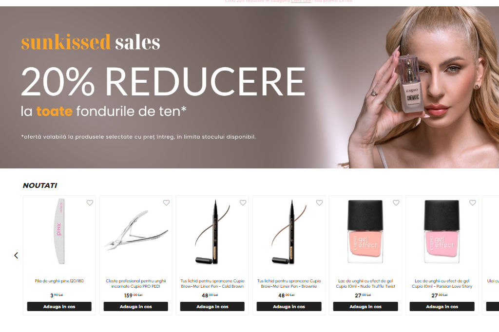
A good picture is worth a thousand words, but on a landing page, it could be worth thousands in revenue. Engaging visuals invite visitors to explore further. Best practices? Use high-quality images that tell a story, videos that explain and engage, and graphics that enhance understanding. Here, the importance of UX design cannot be underestimated, because a good design should guide your visitor’s eyes naturally toward the most important elements, like your CTA, creating a seamless journey from curiosity to conversion.
The mighty Call-to-Action (CTA)
The CTA is the moment of truth where your visitor decides to take action or not. Designing an effective CTA that stands out is about making that decision as easy as possible. “Buy now”, if it’s a product, “Explore more”, if it’s a category, “Grab This Offer Before It’s Gone!”, if it’s a promotion, are all strong examples that guide the user with confidence.
Positioning is also key, so place your CTA where it’s impossible to miss, ideally above the fold and again at the end of your content.
Building confidence with social proof and trust indicators
In the digital world, trust is everything. Testimonials, reviews, case studies, and trust badges aren’t just nice-to-haves—they’re conversion boosters. They show your visitors that others have found value in your offer and that you’re a credible business. Feeling confident is often the reason why your visitors will take the next step.
Creating engaging landing pages with major eCommerce platforms
As we’ve shown above, creating effective landing pages is critical for driving conversions in eCommerce, and leading platforms like Magento, Adobe Commerce, Shopware and Shopify offer robust tools and features to help users design them with ease.
Shopware is renowned for its Shopping Experiences feature, an ideal choice for businesses that want to create unique and engaging landing pages without the need for extensive coding knowledge. The drag-and-drop editor enables the creation of visually appealing layouts that are optimized for conversions.
Even more, the new AI capabilities facilitate a new Scene Editor feature, where users can place any 3D object into an infinite number of settings, helping them create amazing-looking visuals.
Additionally, Shopware supports comprehensive A/B testing, ensuring that businesses can continuously optimize their landing pages based on real user data. For those seeking to take their landing pages to an even higher level, Shopware allows for deeper integrations with third-party extensions that meet specific business needs.
Recommended by Shopware, Shopware CMS Professional expands the native features with additional functions such as dynamic column structures, tab panels, accordions and many other content elements to make it more individual and appealing.
With Magento, merchants can easily use Page Builder, a drag-and-drop content management tool that simplifies the process of creating responsive landing pages tailored to different customer segments.
Even more powerful, Adobe Commerce’s integration with Adobe Sensei, an AI-driven tool, allows for personalized content recommendations, ensuring that landing pages resonate more with individual users. This personalization is key to improving conversion rates, as it aligns content with customer intent.
Additionally, Magento’s comprehensive analytics and A/B testing capabilities allow businesses to continuously refine their landing pages.
For conscious retailers, if these native capabilities are not enough, they can be enhanced with complex third-party extensions.
Amasty Landing Pages for Magento 2 is designed specifically for creating high-converting landing pages. It offers advanced features like the ability to display custom CMS blocks at any place on the page, plus many other tools to increase exposure and reach, like SEO optimization with friendly URLs and the ability to include landing pages in XML sitemaps. It also supports canonical URLs to avoid duplicate content issues, which is crucial for maintaining strong SEO performance.
With Shopify, users can take advantage of a wide range of pre-built templates and themes designed for conversion. These templates are not only visually appealing but also optimized for speed and mobile responsiveness. As with the other platforms, Shopify also integrates easily with a variety of plugins that enhance landing page functionality, such as countdown timers, pop-ups, and lead generation forms, further driving conversions.
Measuring your page performance
A good landing page, beyond appearance, is a page that performs well and converts. And these two are well bonded together. A page that loads quickly and interacts seamlessly is more likely to capture attention and encourage users to stay, explore, and ultimately hit the ‘Buy now’ button. To measure this performance, Core Web Vitals are some of the best metrics available, because they not only follow technical standards, but also key aspects of the user experience. And let’s face it, when it comes to online retail, the whole process, from searching for the products, to ordering, is essential for the success of the business.
If you want to know more about ways to improve your store’s Core Web Vitals, please read our article:
In the end, to understand the importance of having highly optimized landing pages, we can have a look at Harry’s, an online retailer specializing in men’s grooming products.
Initially, Harry’s landing pages were not fully optimized, which resulted in a lower-than-expected conversion rate.
During the process, every aspect of the landing page, from the headline to the call-to-action, was designed to engage visitors and guide them smoothly through the purchasing process.
The headline made clear why their product was superior and why visitors should choose them. High-quality images were used, showcasing the product in a clean, appealing manner. A/B testing was strategically used, allowing them to fine-tune every element of the landing page, including headlines, images, and CTAs, for maximum effectiveness.
As a result of these optimizations, Harry’s reported a 40% increase in conversions on their landing pages – a direct result of the improved user experience, clear messaging and rigorous testing.
If you want to know more about our list of services at Clever++, please visit our website.


